Revamping Slack’s onboarding for a smoother first-time experience
Overview
PROJECT TYPE
Team Project
DURATION
8 weeks
MY ROLE
User Research
User Interview
UXUI Design
Prototyping
Usability Testing
TOOLS
Figma
Figjam
Slack
Challenges
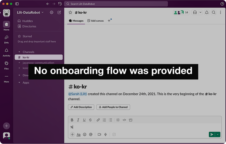
New users struggled with Slack’s terminology and often missed important notifications.
Unfamiliar English terms made it hard for new users to understand key features, and too many notifications led to missed messages, added stress, and disrupted their work.
Main Features
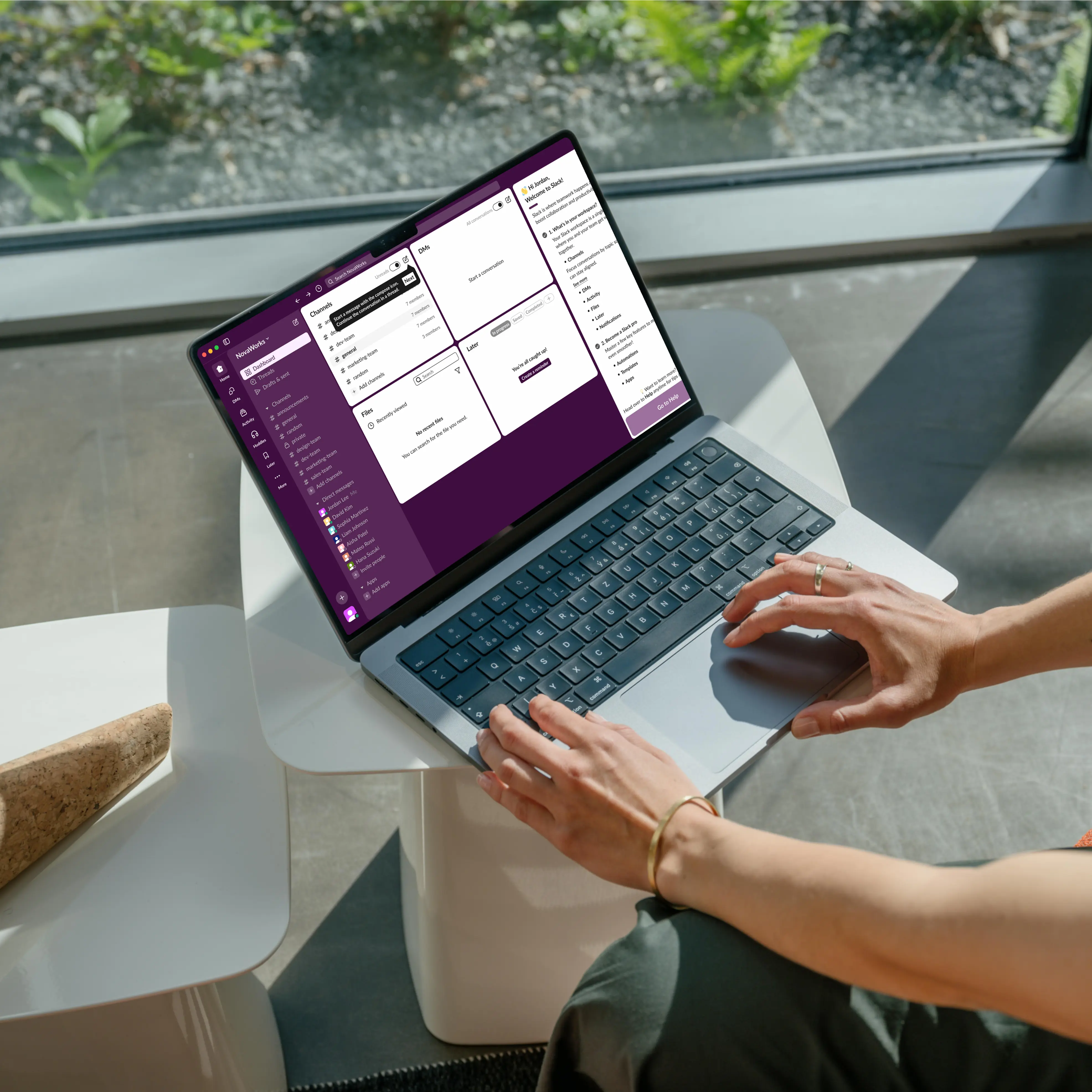
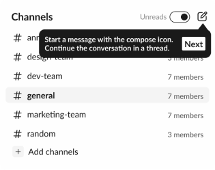
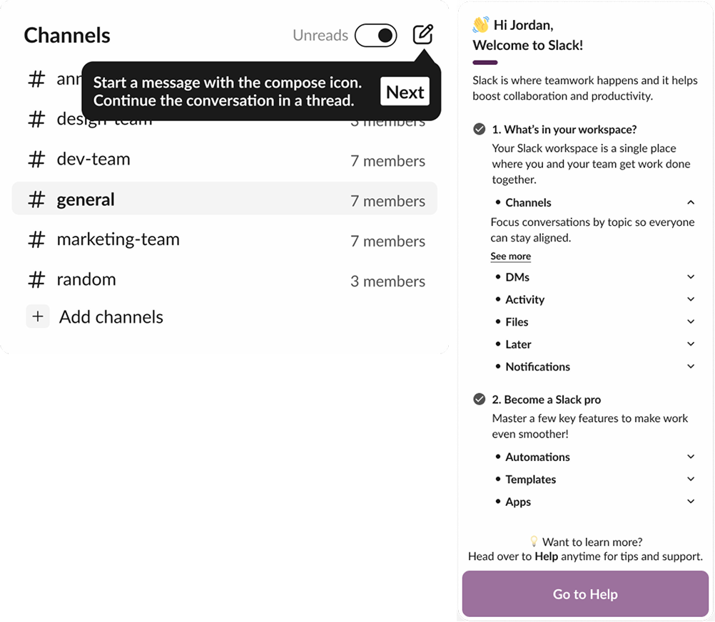
Onboarding guide for quick and easy adoption
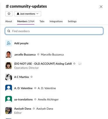
With the dashboard panel, users can understand complex terms and features, and quickly revisit them whenever needed.
AS IS
TO BE
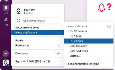
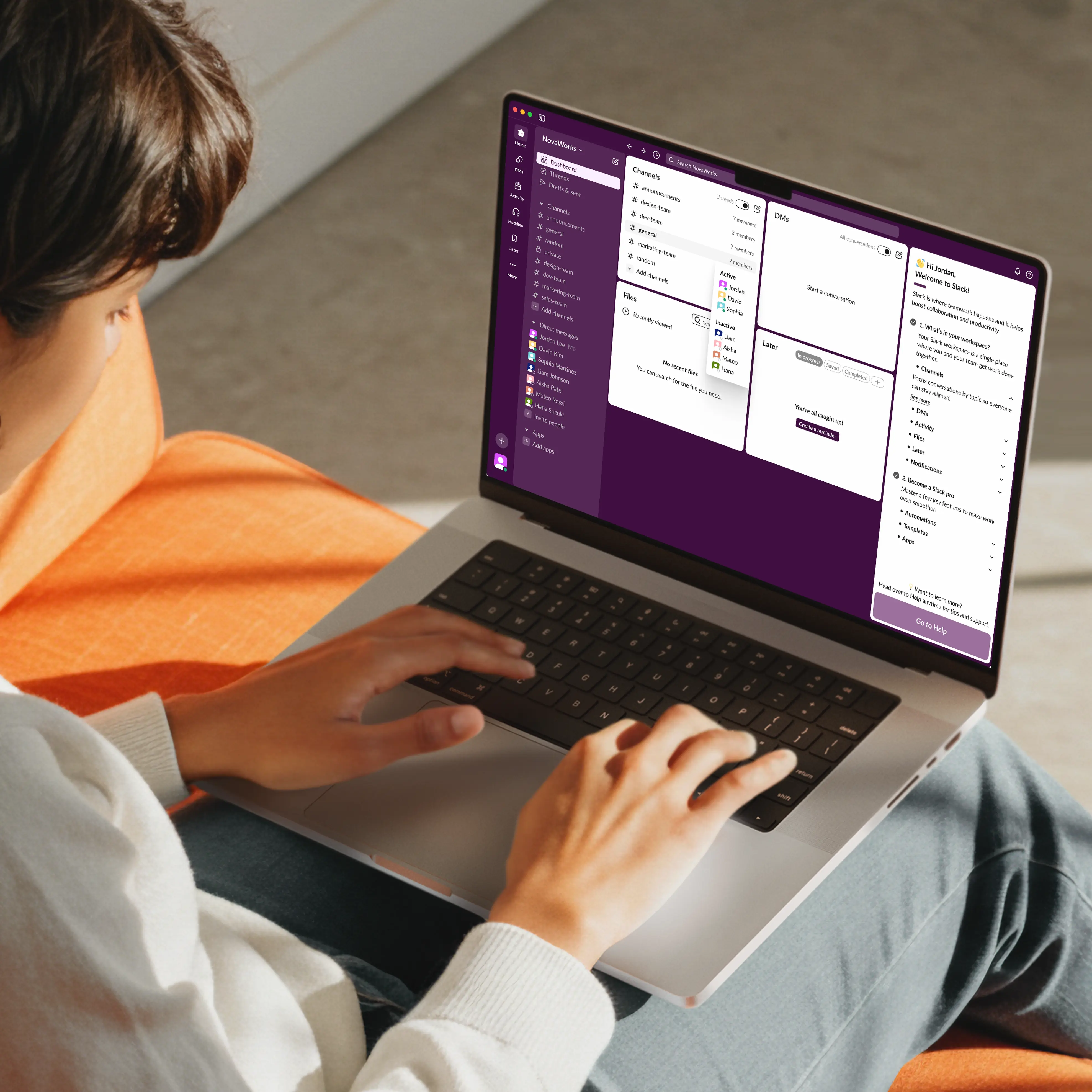
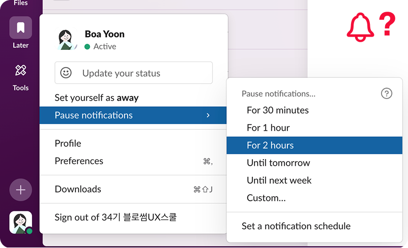
Global notification control
Users can quickly adjust notifications using an easy-to-find icon and stay focused with a global toggle that reduces distractions.
Design Process
01
Discover
Competitive analysis
App review analysis
User Interviews
Empathy mapping
Affinity mapping
Key issues extraction
02
Define
Problem statement
Persona creation
HMW statements
Prioritization
Selecting final direction
03
Develop
Ideation
Crazy 8’s
User flow
Low fidelity wireframes
Prototypes
High fidelity designs
Style guide creation
04
Deliver
Usability testing
SUS
Test analysis
Key issues
Iterations
Final UI refinements
Final prototype
Discover
Research
More teams rely on digital tools, but first-time users still fall behind.
We reviewed 10+ academic papers on digital collaboration and workplace messaging and found that hard words, confusing layouts, and scattered messages make apps harder to learn, causing people to miss messages and work more slowly.
Academic research highlighting user challenges in digital collaboration tools
App Review
The main barrier is not functionality, but early understanding.
Many employees feel stressed learning new tools quickly, which hurts teamwork and communication. We reviewed 200+ app reviews and community posts, grouped issues into seven types, and counted how often they appeared.
“Trying to make my way through the Slack menu feels like a chaotic maze.”
“I can’t seem to get my phone to alert me properly when new messages come in… I still miss important updates.”
“What’s the best way to avoid getting drowned in Slack messages?”
“It’s complicated and not intuitive.”
Raw Data Collection (App Reviews & Community Posts)
App Review Pain Points (Total Mentions)
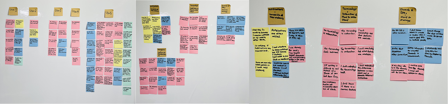
User Interview
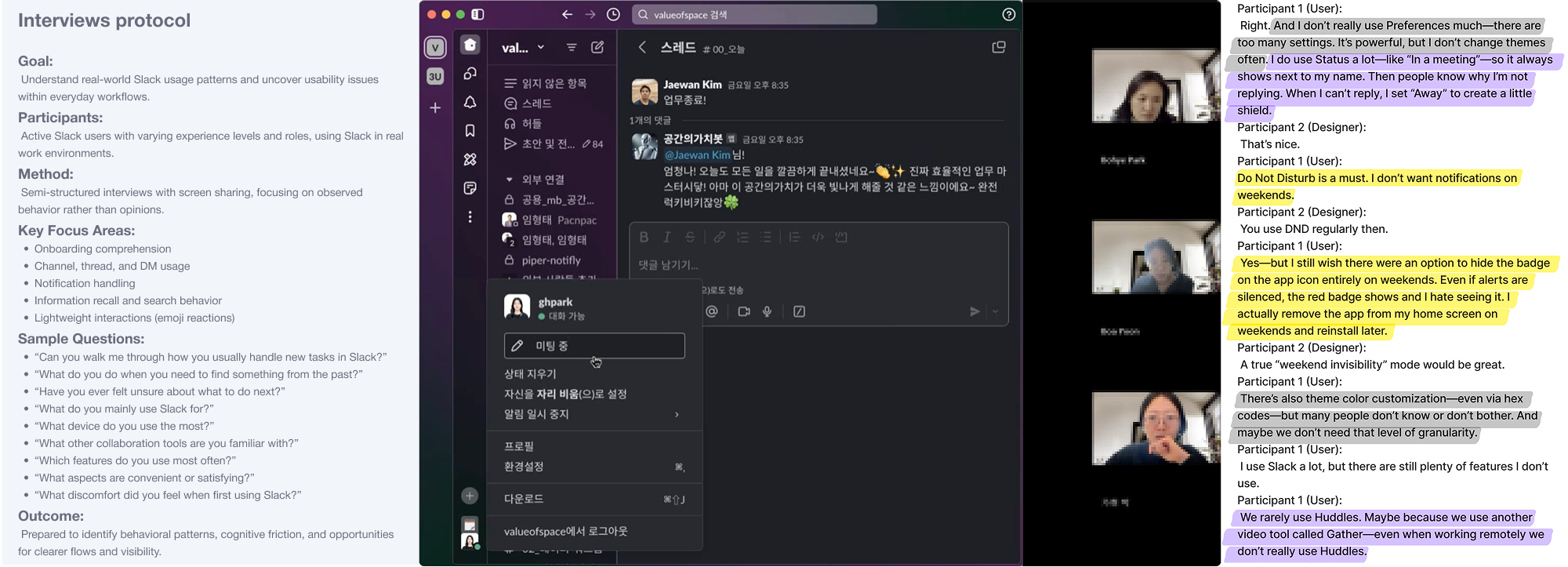
To understand what confuses real Slack users, we interviewed 5 active users.
We interviewed five planners, designers, and PMs aged 23–31 who use Slack every day and asked how they use channels, threads, terms, and notifications. This helped us see where people get confused and how that confusion slows real work.
Interviews protocol & User interview recording
Data gathering
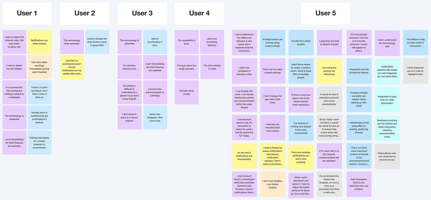
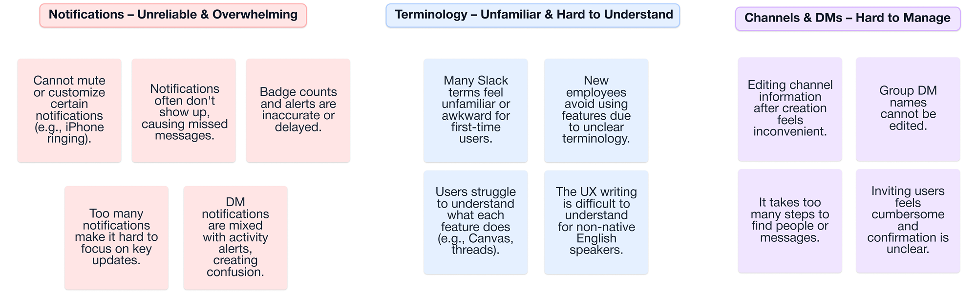
Key Findings
Terminology and information overload block early understanding.
Interviews showed that confusing terms and too many notifications caused 80% of users to struggle with Slack’s core features and 60% to miss messages, showing that too much information early on—not feature complexity—was the real problem.
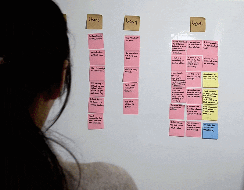
Affinity mapping
Define
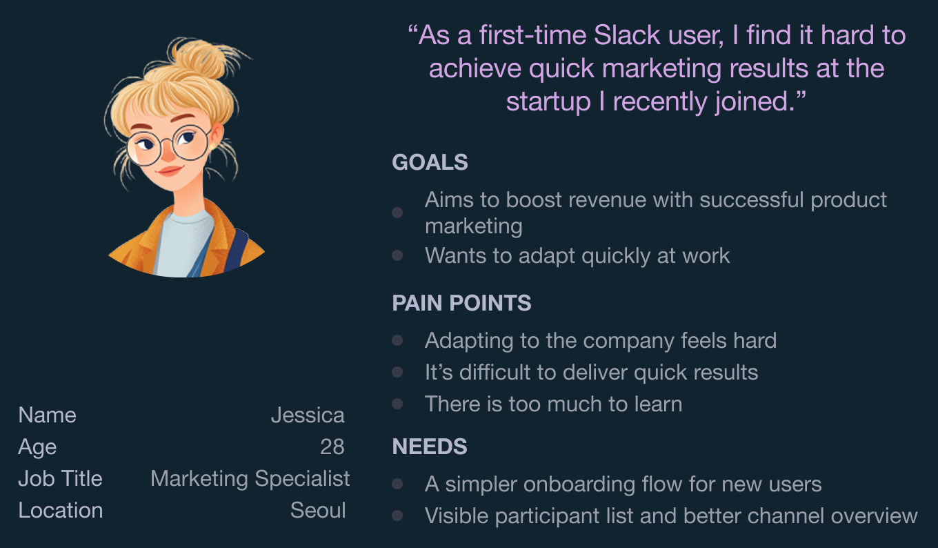
Persona
When onboarding fails, early struggles reveal the real problem.
We focused on first-time Slack users joining startups, where onboarding problems are easiest to see. This showed that confusing terms and too much information slow early use and helped us identify the most important onboarding challenges.
Problem Statement
Unfamiliar terminology slows first-time users’ understanding of Slack’s structure and features.
HMW
How might wehelpnew Slack users understand key terminology?
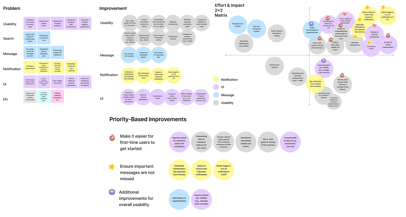
Ideation
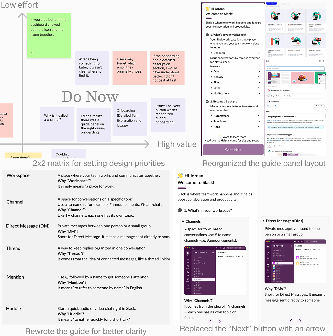
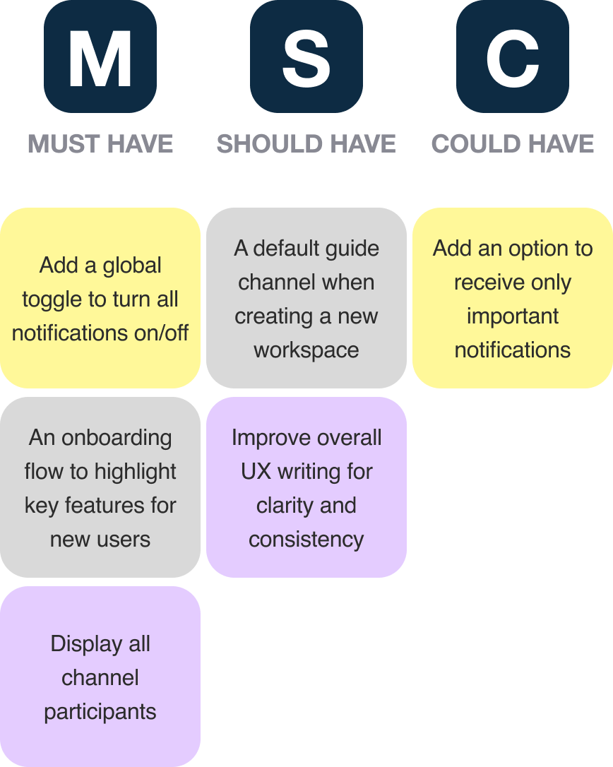
2x2 Matrix & MoSCoW Prioritization
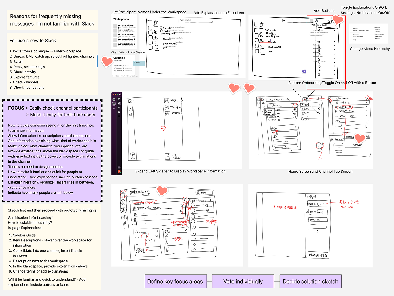
We focused on the most important ideas first.
We brainstormed solutions for all user issues and marked essential ideas with stickers. With limited time, we used a 2×2 matrix and MoSCoW to prioritize improvements that help users adapt faster and avoid missed messages.
Develop
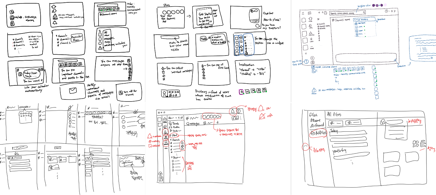
Sketches & Crazy 8’s
Using familiar UI patterns, we planned to show more details later in a dashboard guide.
We asked if showing only key information first could reduce confusion. We compared ideas with sketches and Crazy 8s to choose clearer ways to manage notifications and channels.
After reviewing and voting on the sketches, we chose a direction that clarified the flow.
We considered a customizable dashboard but chose faster implementation, focusing only on the features most often mentioned in user interviews.
How we decided solution sketch
User Flow
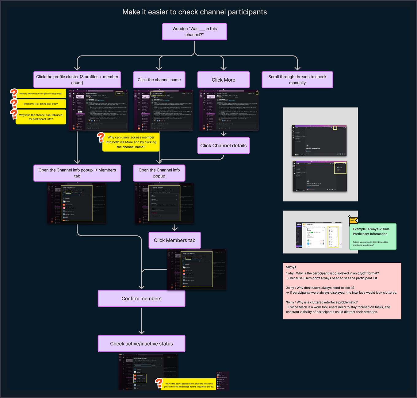
Channel flow showed where new users get confused.
Next, we focused on the channel flow as a key onboarding problem. We mapped how first-time users check who is in a channel and found that too many entry points made them hesitate and lose focus.
Low fidelity design
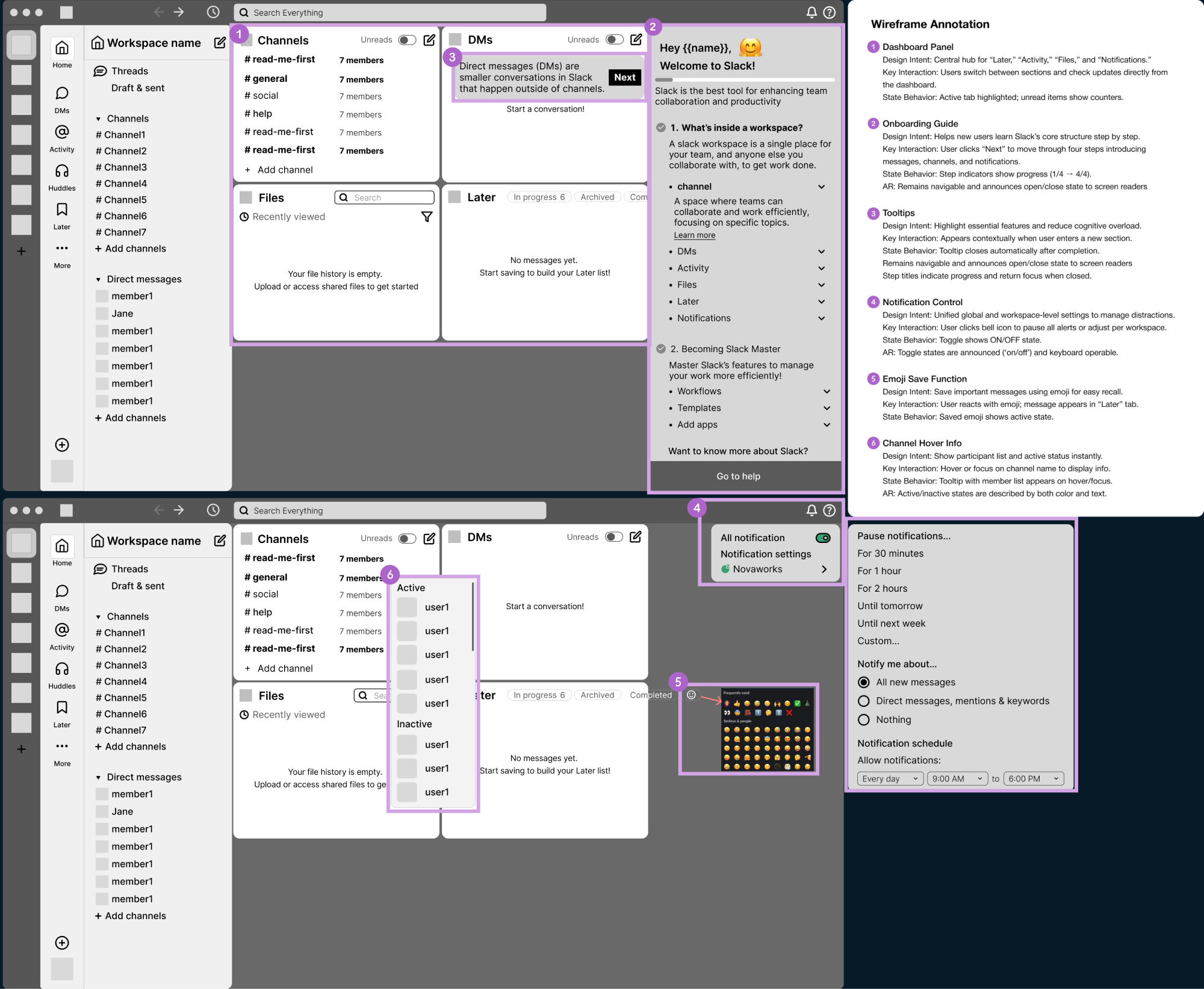
Wireframes helped us test the structure before adding details.
We created low-fidelity wireframes to show the new structure and fix usability issues. Each screen was annotated to explain design intent, interactions, and accessibility needs.
Style guide
To stay consistent with Slack’s design system, we created a style guide.
We refined color contrast, typography, and component hierarchy to improve clarity and create a more visually consistent experience across the product.
Deliver
High fidelity design
AS IS
TO BE
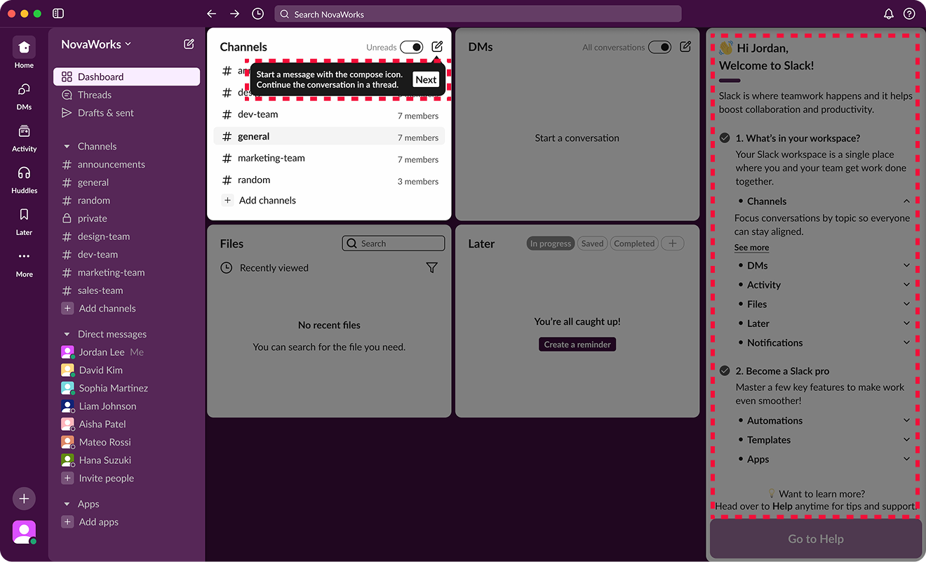
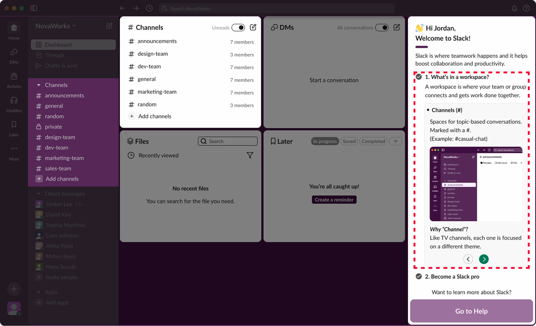
Dashboard with onboarding guide and help panel
AS IS
TO BE
Global notification controls
AS IS
TO BE
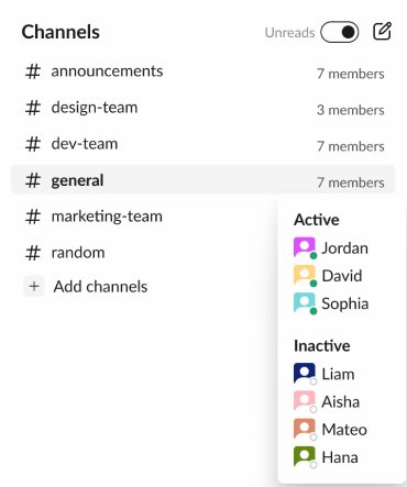
Hover over dashboard channels to instantly see active / inactive members and total count.
AS IS
TO BE
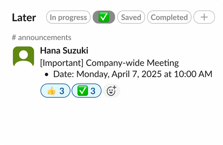
All emoji-marked messages appear in the “Later” tab for easy review and response.
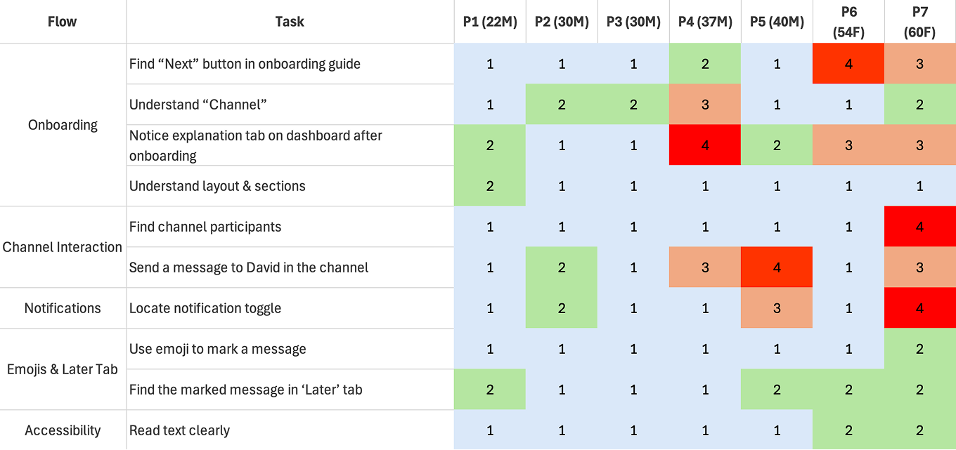
Usability test
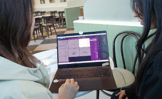
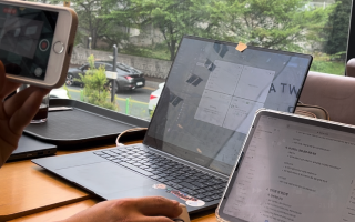
We ran usability testing with 7 participants from different age groups.
Task
After onboarding, find a channel where David is and send a message
Mark an important message and find it later
Turn off notifications for 2 hours
Task Completion Assessment
We checked how easily users completed each task.
During each session, we watched how participants used the product and how easily they finished tasks. When they struggled or failed, we asked short follow-up questions to understand what made the tasks difficult.
Easily Done
Slightly Struggled
Significantly Struggled
Failed
Task Result
First-time users could navigate Slack more easily thanks to the redesigned onboarding.
The redesigned onboarding and dashboard scored an average SUS of 72.1, showing good usability. While some UI elements were slightly hard to see, overall feedback was very positive, especially for the clear onboarding flow, intuitive dashboard, and improved notification toggles.
Conclusion
Users could navigate the dashboard easily after onboarding, yet some areas required stronger visual cues for better understanding.
Iteration
Test results guided final improvements to onboarding and UI visibility.
We used the remaining time to improve the design based on data and user feedback, prioritized the onboarding guide and UI visibility with a 2×2 matrix, simplified the guide, and replaced the “Next” button with an arrow icon for clarity.
Enhanced onboarding visibility
We improved brightness contrast and made key text larger to increase visibility. The guide panel was rewritten in simpler terms and moved to the right side, making the information easier to follow.
AS IS
Users in their 50s–60s struggled to find the “Next” button and read onboarding text because of small font size and low contrast.
TO BE
We improved clarity by increasing contrast, simplifying terms, moving guidance to a right-hand panel, and highlighting the “Next” button for a clearer flow.
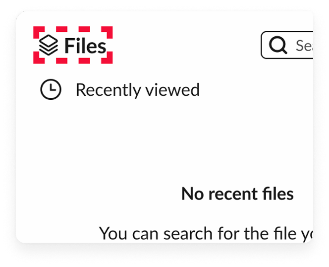
Added icons to dashboard features
By adding icons next to text, we helped users recognize dashboard items faster.
Repositioned notification icon
Users had trouble noticing the notification icon in the top-right corner, so we moved it to the left where related functions are grouped.
Reflection
Takeaways
01 Seeing Through the User’s Eyes
Usability testing revealed the need for more prominent UI elements, clearer feature explanations, and detailed term guidance. I also learned that combining icons with text—rather than using text alone—improved familiarity and speed of recognition.
02 Context-Driven Design Decisions
Noting that desktop usage outweighs mobile, prioritization of improvements was focused on the desktop experience. Learning that the importance of features varies depending on the product’s usage context.
03 Every user sees it differently
Usability testing revealed that even users in the same age group can have very different needs. Knowing I couldn’t satisfy everyone, I chose to focus on making the experience simple and accessible for as many people as possible.


.gif)

.gif)