Turning early confusion into early action with AI-powered abuse detection and guidance
Overview
PROJECT TYPE
Individual Project
DURATION
8 weeks
MY ROLE
User Research
User Interview
UXUI Design
Prototyping
Usability Testing
TOOLS
Figma
Figjam
Slack
Challenges
41% of women and 26% of men experience verbal abuse from their partners.
However, victims often lose time trying to recognize the abuse and figure out how to respond on their own, which can make the situation worse.
Main Features
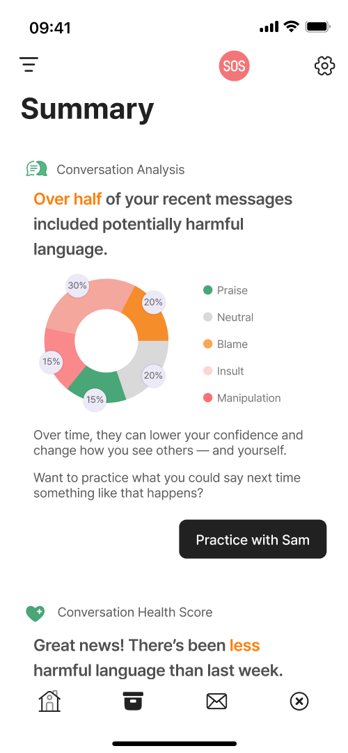
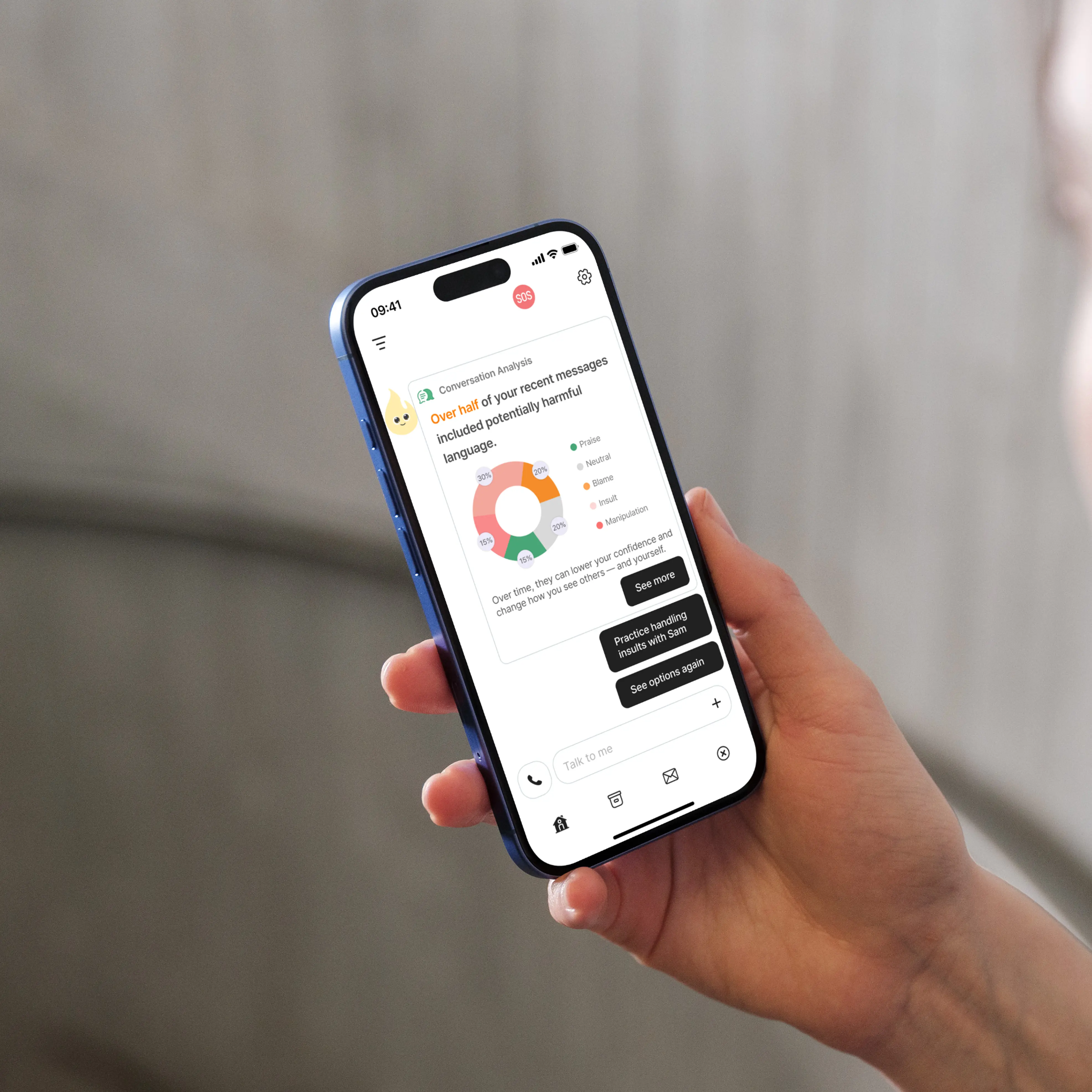
Analysis of verbal abuse patterns and users’ emotional states
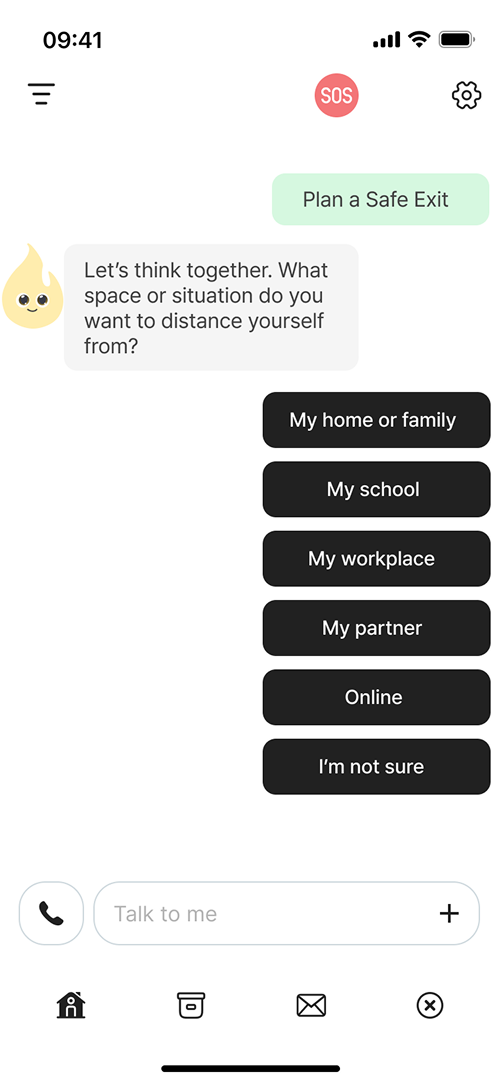
Set goals together and practice coping strategies to help escape abusive situations.
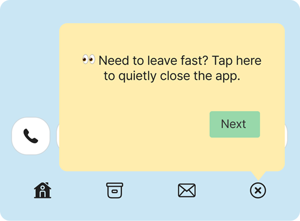
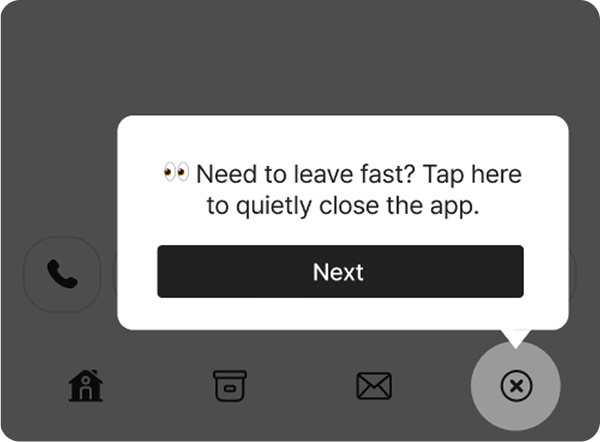
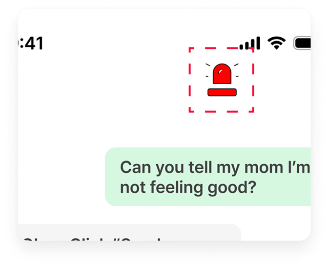
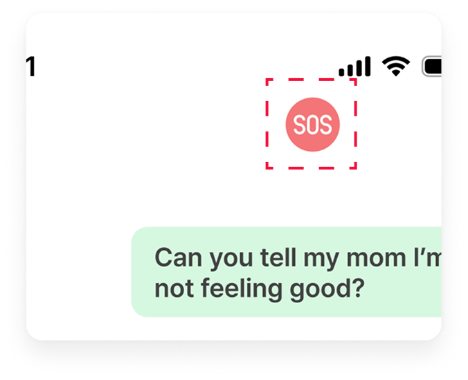
Quick reporting without the abuser knowing
When verbal abuse is detected, a message is sent using a preset name and code. If the user replies with “1,” it automatically reports to 911.
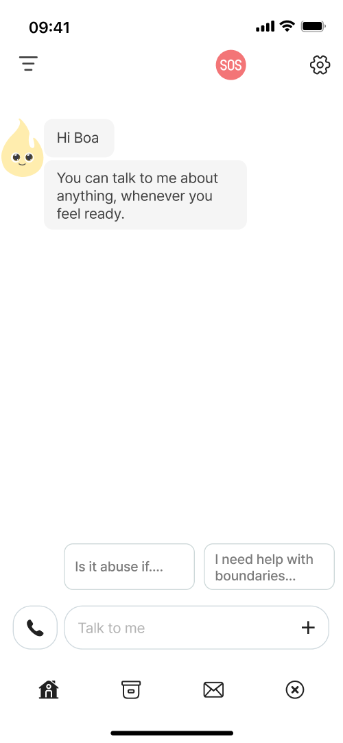
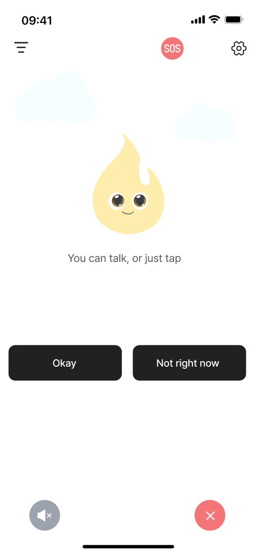
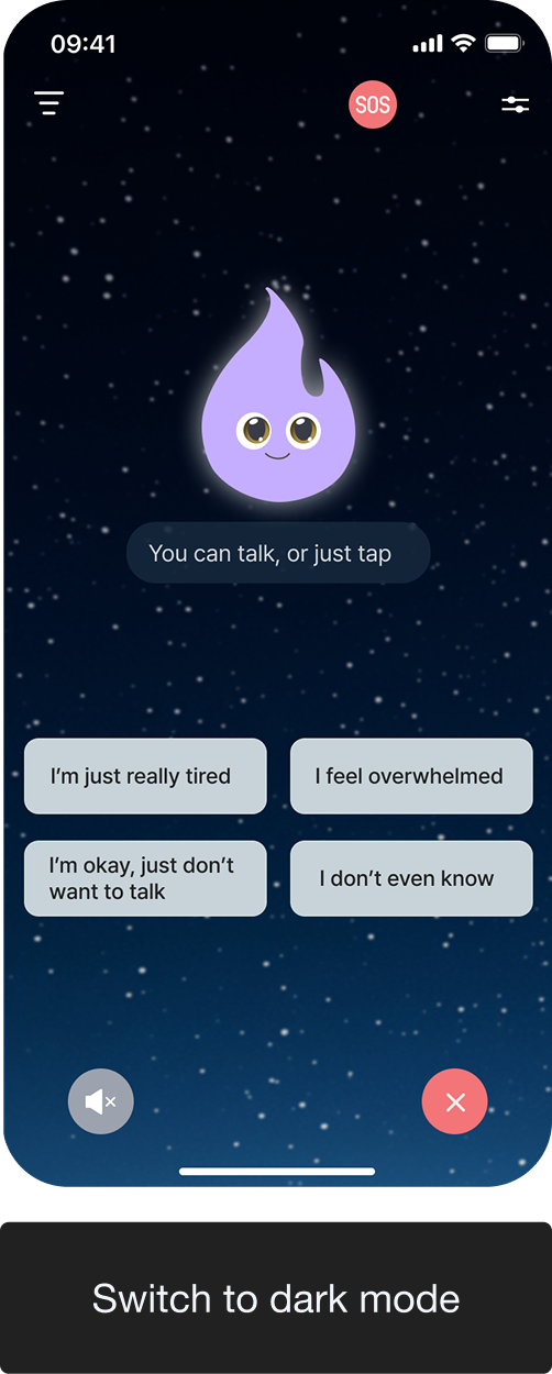
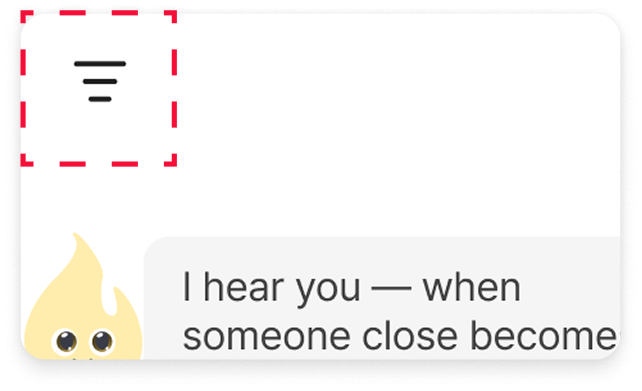
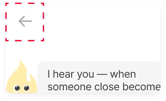
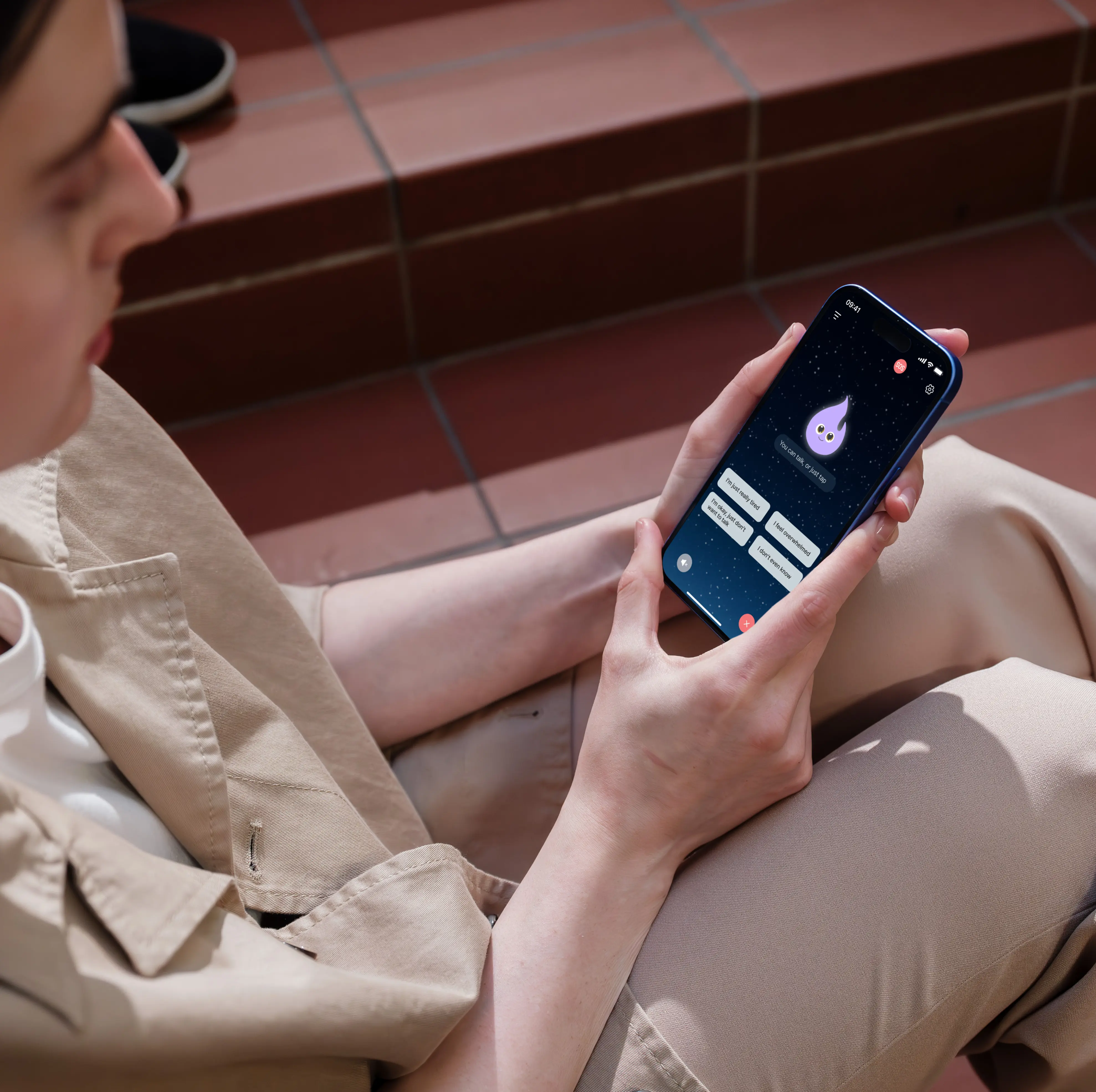
An AI friend that helps solve problems together
After easy sign-up, it provides guidance on how to deal with verbal abuse whenever needed.
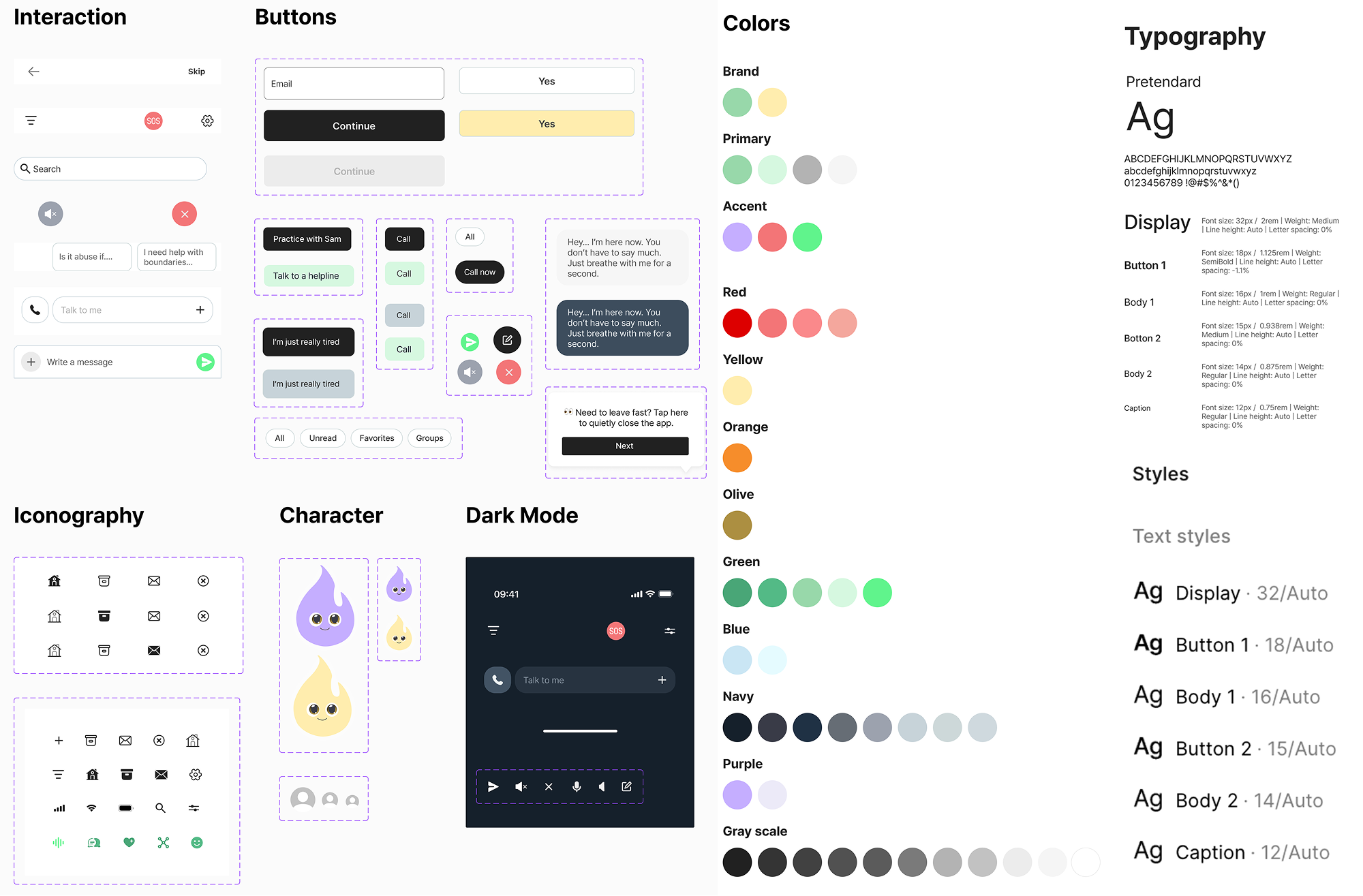
Design Process
01
Discover
Competitive analysis
App review analysis
User Survey
Affinity mapping
Key issues extraction
02
Define
Problem statement
Persona creation
User journey map
IA
Storyboard
HMW statements
Prioritization
Selecting final direction
03
Develop
Ideation
Crazy 8’s
User flow
Low fidelity
Prototypes
High fidelity
Style guide
04
Deliver
Usability testing
SUS
Test analysis
Key issues
Iterations
Final UI refinements
Final prototype
Discover
Research
Partners, family and friends. Verbal abusers are often the people we see every day.
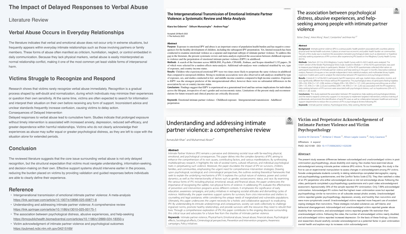
After reviewing more 5+ academic studies, I found that confusion and lack of guidance make it hard to leave abusive situations. Delayed response often leads to ongoing emotional pain and worse outcomes.
Literature Review & Academic Paper
Competitor research & App Review
However, victims are still left to find a way to escape their abusers on their own.
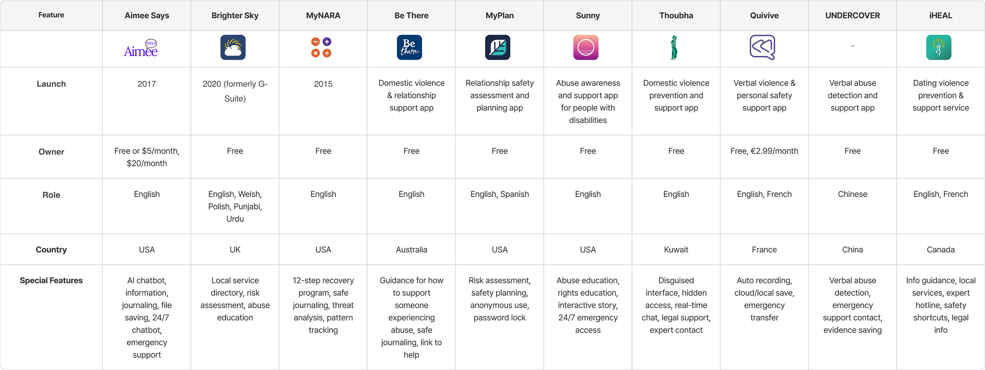
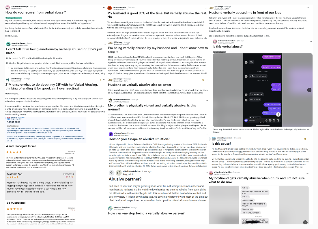
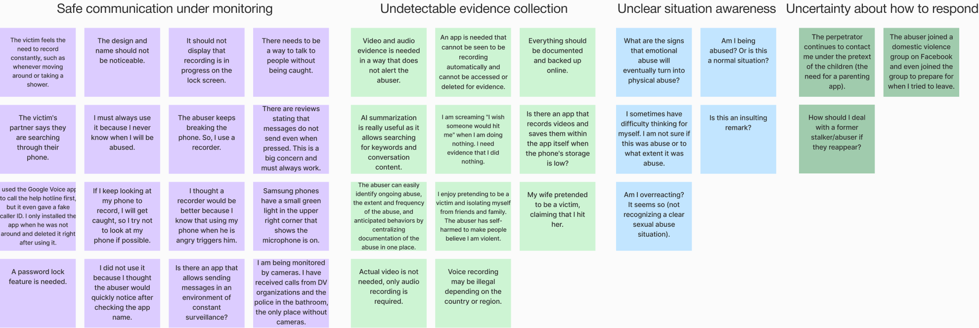
I reviewed 10+ verbal abuse apps and found that victims had to find information and report abuse on their own. I then read 100+ app reviews and community posts, grouped issues into four types to understand what problems people were facing.
Competitor research
"I'm constantly being monitored by my abuser"
"Is there an app I can use without getting caught?"
"Is this abuse?"
"How should I respond?"
Raw Data Collection (App Reviews & Community Posts)
Affinity mapping
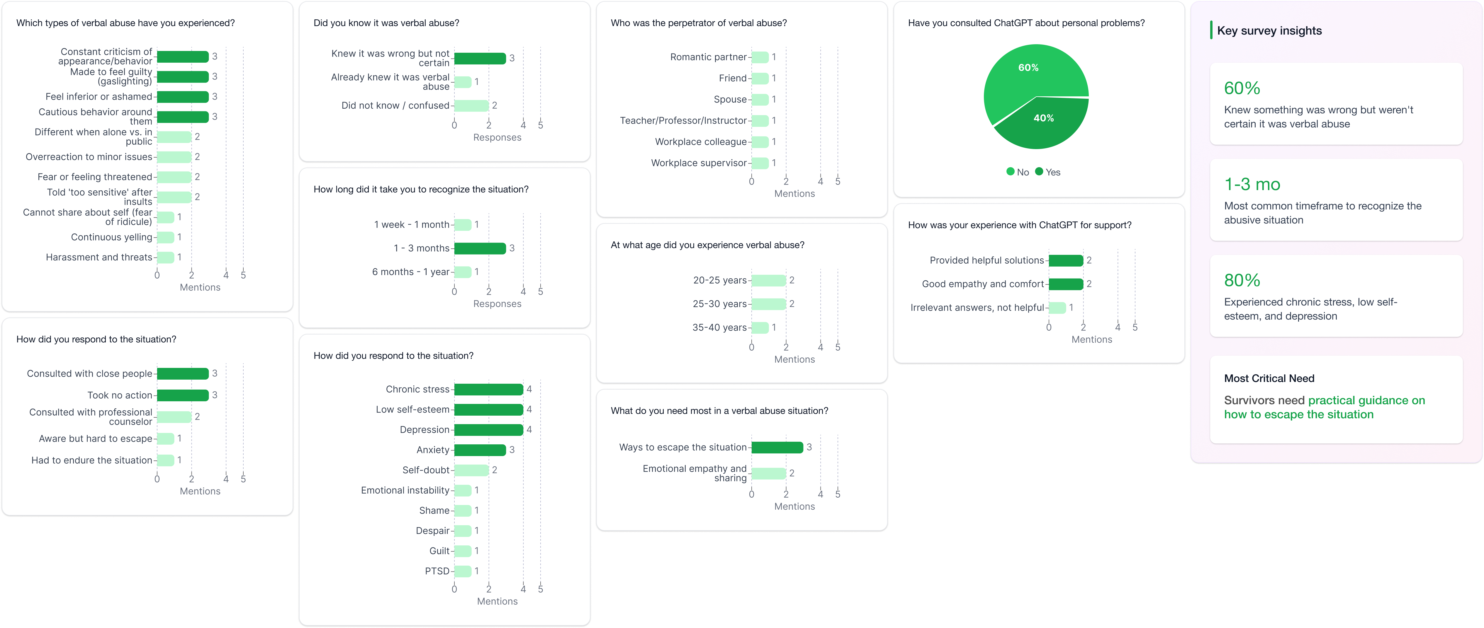
User Survey
Survey results showed that 60% of users needed guidance on how to get out.
I surveyed four people who had experienced verbal abuse with simple questions. I focused on which was harder, noticing the abuse or knowing how to respond. This helped me understand what support people need most in that moment.
Survey results
Define
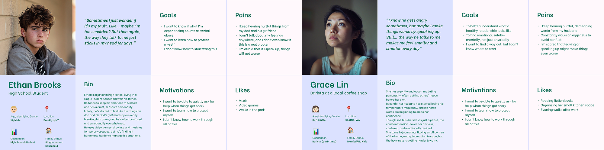
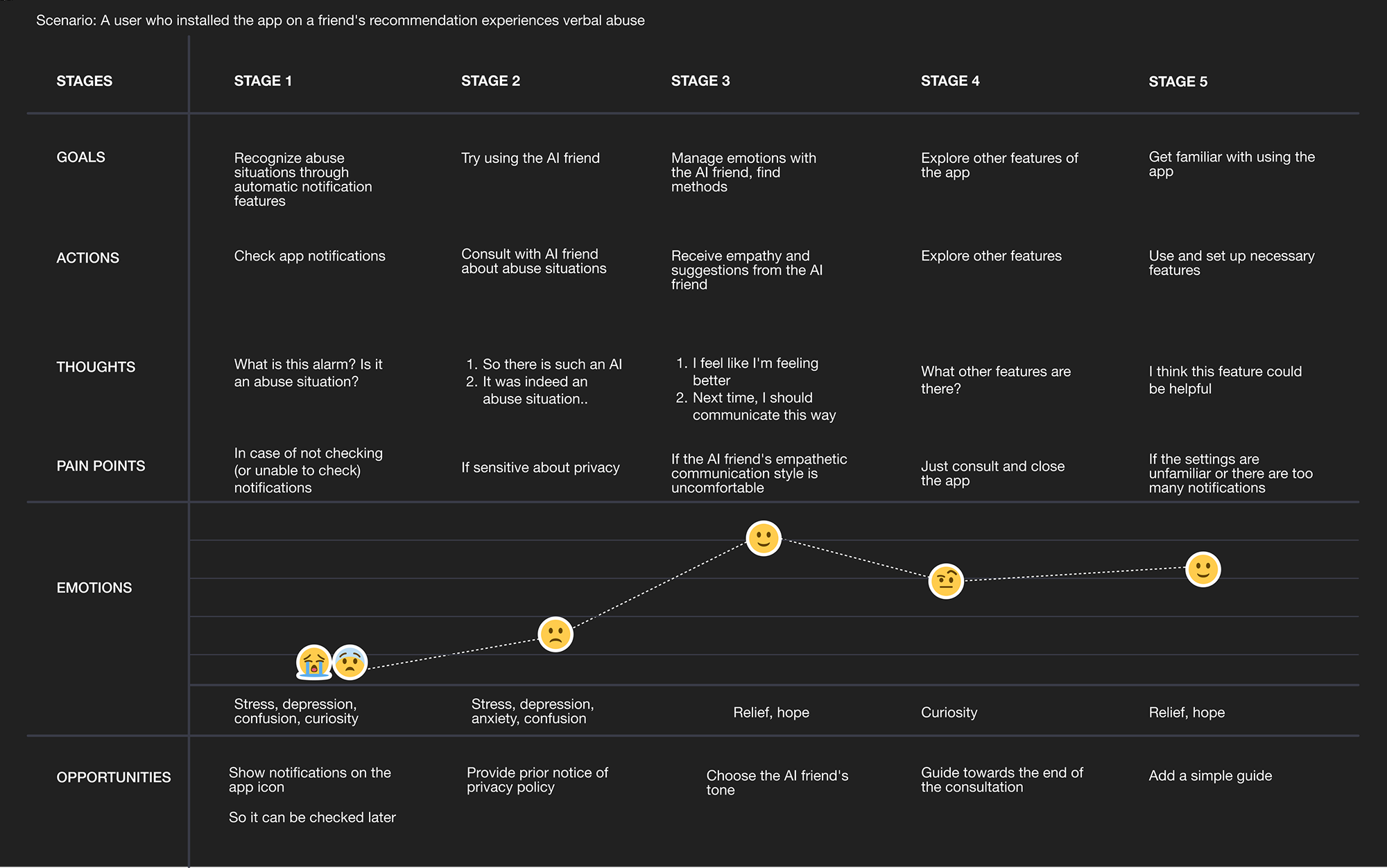
Persona & User’s Journey Map
When no one steps in first, delayed action leads to anxiety, depression, and dependence.
I focused on teenagers and low-income women — the groups most at risk based on my research. This showed that a lack of clear guidance and places to get help slows early response and helped me identify the most important need for early guidance.
Problem Statement
After recognizing verbal abuse, victims are left to respond alone without knowing what steps to take next.
HMW
How might wespotverbal abuse and guid what to do next?
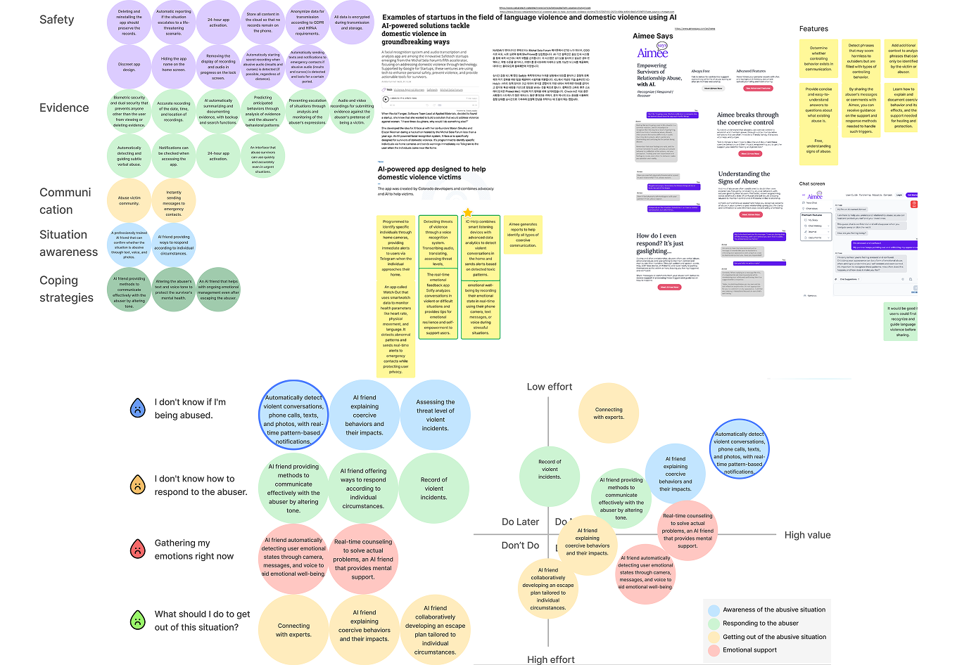
Ideation
2x2 Matrix & MoSCoW Prioritization
Choosing solutions that protect legally, not just technically.
Many users requested recording features, but consent laws vary globally. Using a 2×2 matrix to weigh legal safety against user needs, I prioritized automatic voice detection that helps everyone without legal risks.
Develop
Sketches & Crazy 8’s
How do you help someone being watched by their abuser?
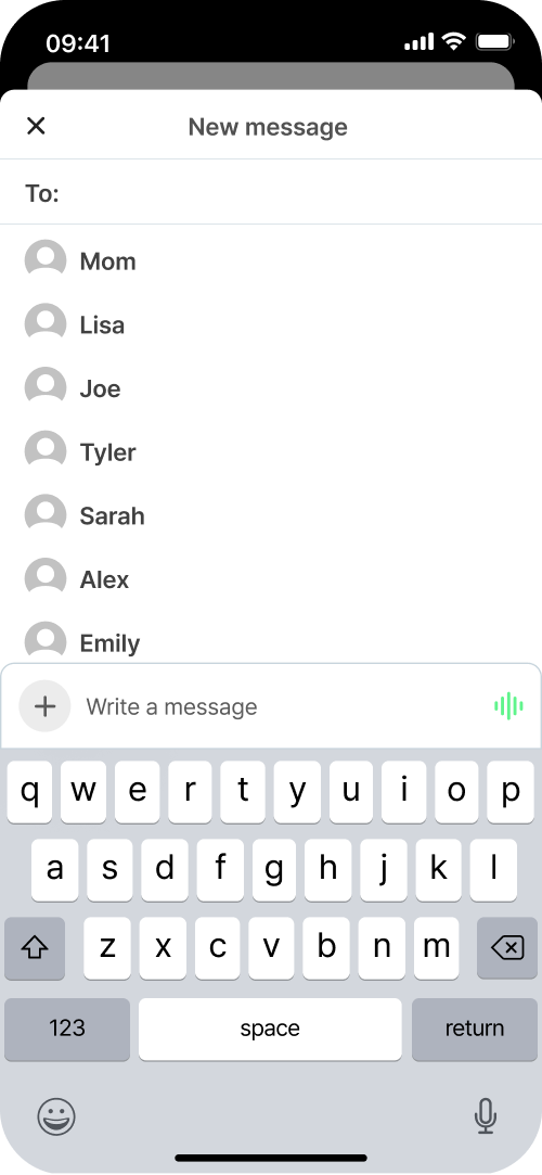
I sketched designs that look like normal chat apps to stay hidden. Through Crazy 8s, I explored ways to enable quick emergency reporting while keeping the interface unnoticeable to abusers nearby.
Character Design
I named it Lumaid, combining Light and Aid.
Like a friend who brings light in the darkness, the bright sky background offers hope during serious moments, while dark mode's starry night provides calm comfort.
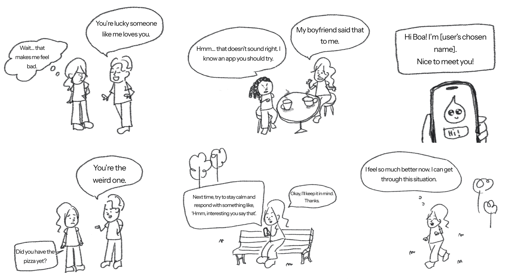
Storyboard
Putting Myself in the User’s Shoes
I quickly drew a storyboard on my iPad while imagining real user situations. Seeing everything visually helped me understand the flow and pinpoint the problematic parts.
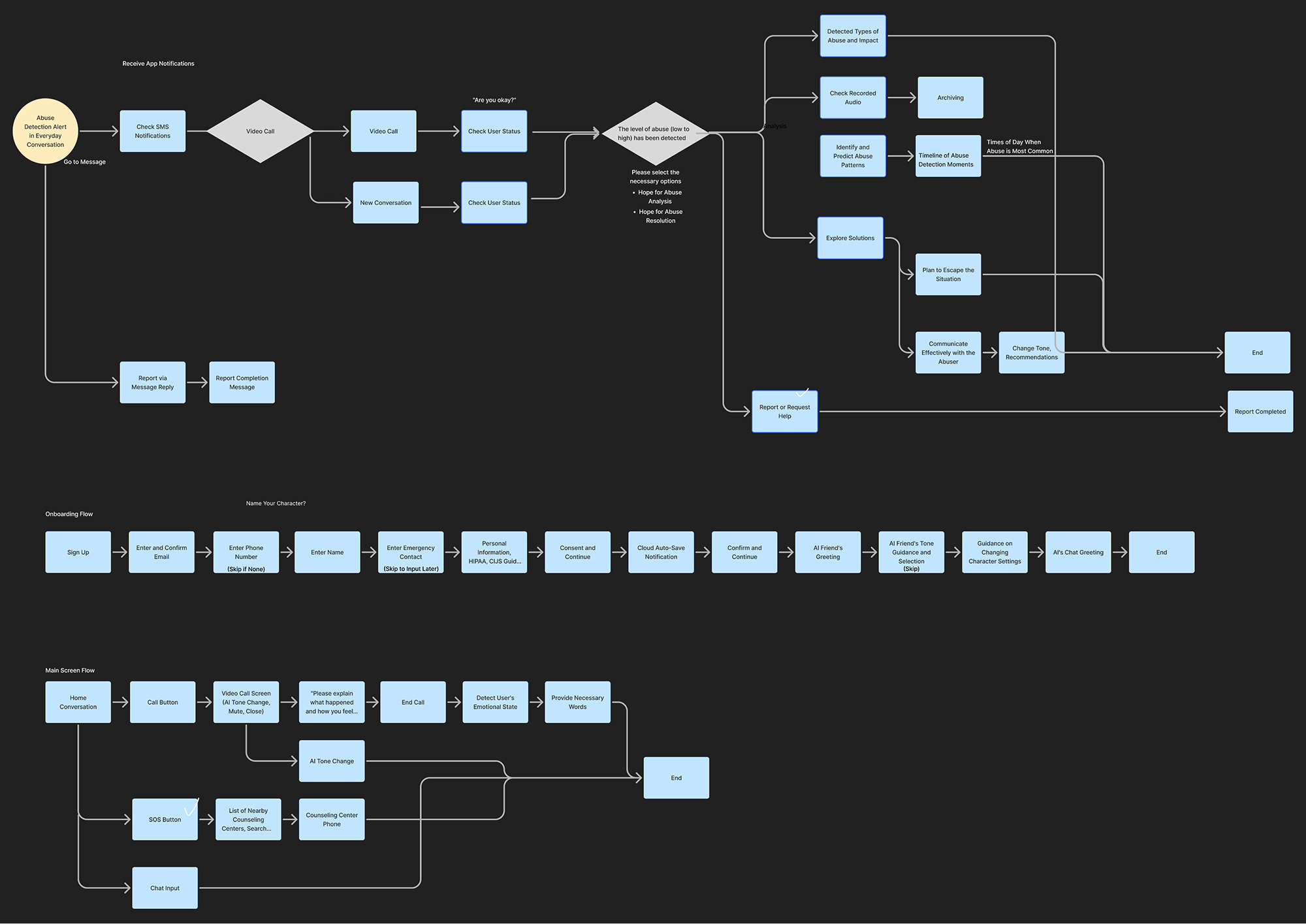
User Flow
Different danger levels need different responses.
I designed two flow versions to match urgent versus less urgent situations and focused on practical steps users can take with their AI companion.
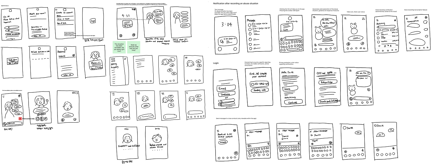
Low fidelity design
Wireframes helped us test the structure before adding details.
Each screen was annotated to explain design intent, interactions, and accessibility needs.
Style guide
Looking normal keeps users safe.
I used soft colors and easy-to-read text to help users feel calm.
Deliver
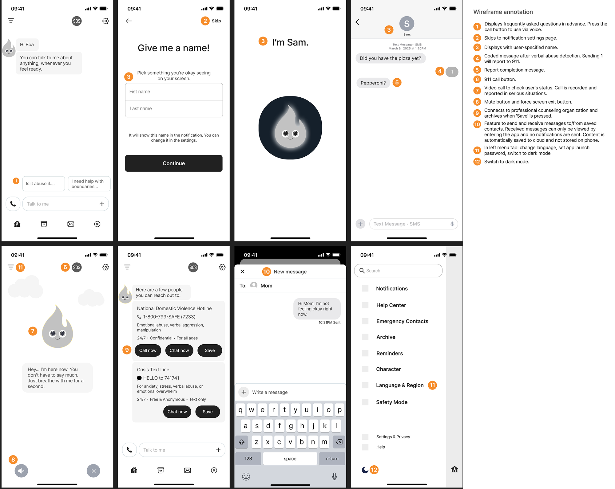
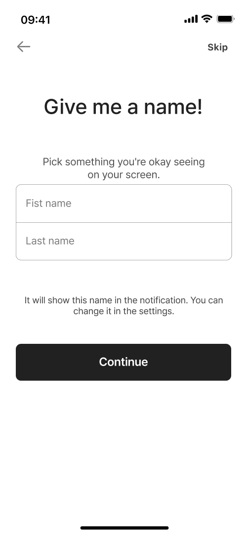
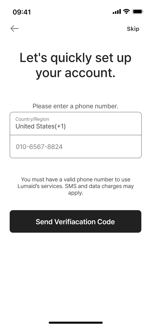
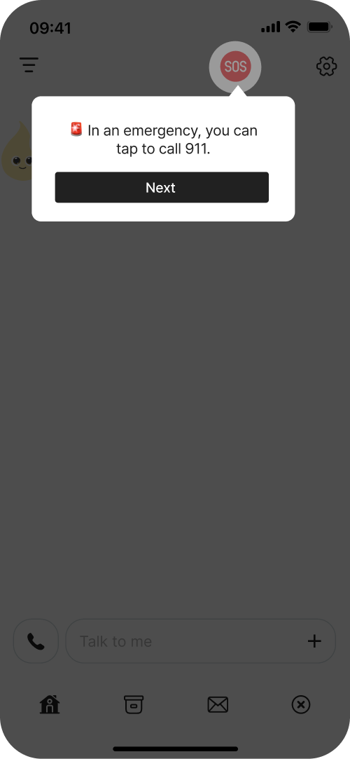
High-fidelity design
One-tap SSO login
Custom AI name Hide from abusers
Global sign-up with any phone number
Quick report button on home screen
Your AI friend, always here
Pick options to make a safety plan
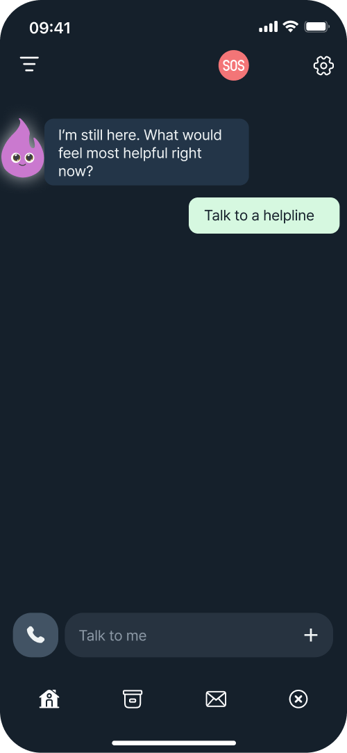
Dark mode for chats
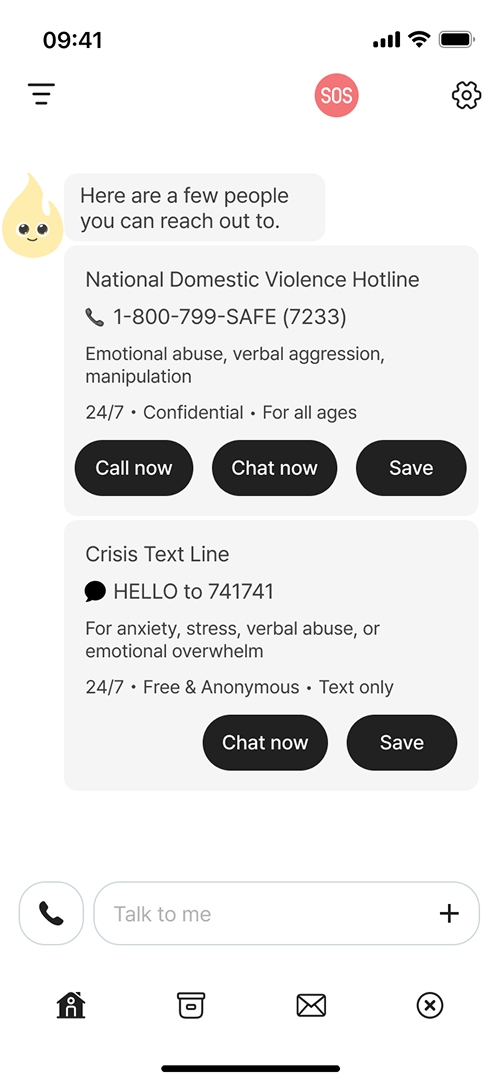
Find nearby help centers fast
Chat with friends No history saved
Auto-connect your contacts
Check your situation & practice how to respond
Video call to check if user is safe
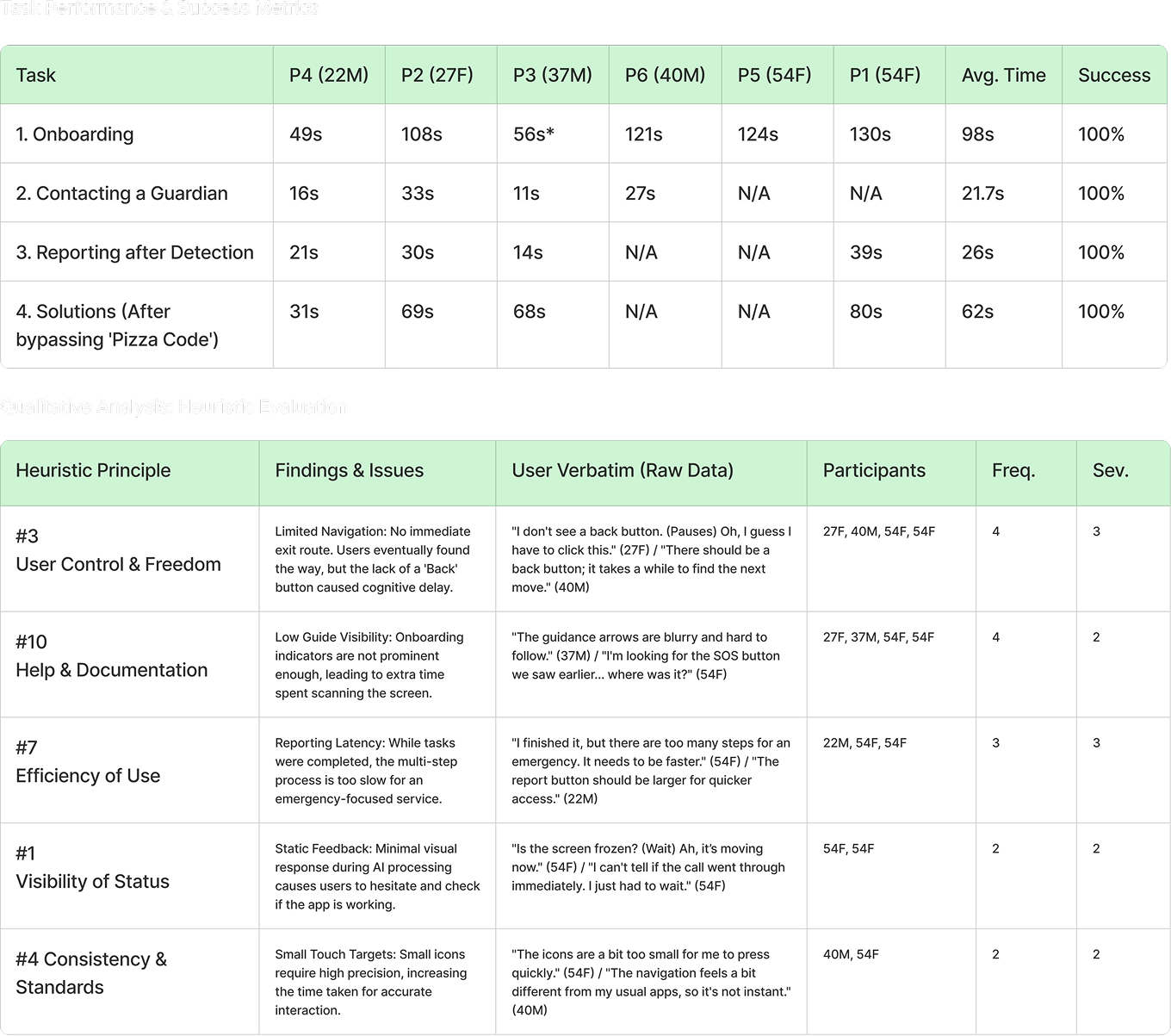
Usability test
I ran usability testing with 7 participants from different age groups.
Task
Complete onboarding
Send a discreet help message
Respond to emergency detection alert
Review detected abuse and solutions
Task Completion Assessment
I checked how easily users completed each task.
During each session, I watched how participants used the product and how easily they finished tasks. When they struggled or failed, I asked short follow-up questions to understand what made the tasks difficult.
Task Result
Users felt relieved that Lumaid helped them first, and some became deeply engaged.
With an average SUS score of 72.5, it's easy to use. Some UI elements were a bit hard to see, but overall people really liked it. Users loved checking verbal abuse and status, reporting emergencies quickly without telling anyone, and the easy option selections.
Conclusion
Users could use Lumaid easily, but they needed simpler options and clearer visual cues for faster reporting.
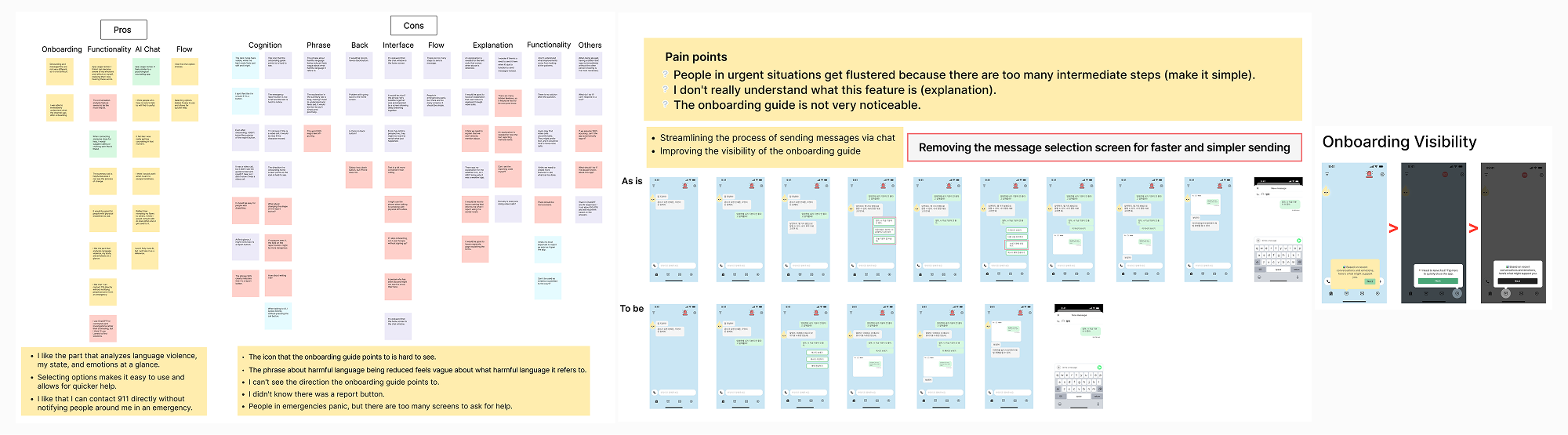
Iteration
Based on data and feedback, I made the chat options shorter and easier to see.
I focused on helping users get help quickly and accurately. I improved the design to be visually clear at a glance and easy to use in stressful situations.
Simplifying options for faster contact
Feedback showed panicked users struggled with too many steps. I simplified options and enabled quick communication with trusted contacts.
Improving guide visibility
Users couldn't see the guide direction. I enhanced contrast for better visibility.
Adding text to report button
Users didn't recognize the report button. I added a text label to make it instantly clear.
Adding a back button
Users wanted to exit the chat screen. I moved the menu button to the right and added a back button.
Reflection
Takeaways
01 Understanding Users in Crisis
Users need a way to respond quickly and simply in emergencies. Through this project, I learned that too many options can actually increase confusion. I gained a deeper understanding of the importance of designing fast, intuitive flows that consider the user’s situation.
02 Prioritizing Core Features
Since not every problem can be solved at once, I focused on the most essential functions: detecting verbal abuse, sending secret signals, and enabling safe messaging. Within limited time and resources, I learned how to streamline key user flows and guide important actions naturally.
03 Improving Through User Feedback
Early usability tests revealed unexpected issues, which I was able to quickly iterate on. Reflecting real user voices taught me the value of designs that are immediately clear at a glance and reinforced the need for continuous improvement.
Next Steps
The goal is to expand practical ways for users to get support, like “responding with an AI friend.” I also plan to partner with domestic violence hotlines to enhance quick connection and response capabilities.

.gif)

.gif)